Thursday 29 March 2012

Track side signs and crowd barriers

A few models of basic ideas for barriers and advert boards for around the track

Friday 16 March 2012

Thursday 8 March 2012

LIghts, Screens, Grass texture 1


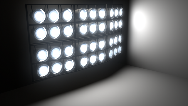
Test shots of lights around the track


I have placed the bits I have been modelling in to one scene to see how the lighting effests the objects, i have also textured some grass for around the track which you can see in use in the picture above

Wednesday 7 March 2012

Grass Texturing

Surface with grass image

Surface with Bump Map and single grass image

Surface with Bump Map and Reapeated UV grass image 


Spot Lights and Fog - Tests


I have added fog to the lights. I still want to tweak the fog settings and maybe add a subtle colour to the ambient lights once in scene.

Updated Lights with Scaff tower


I have got the ambient light looking better, I am now going to put spot lights in them for the beams.

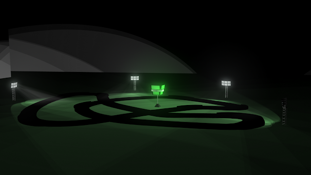
Track layout for racetrack


here i have laid out the track for our racetrack. The environment will be built up around it.

creating a detailed tyre in Maya for Racetrack Scene


By following a tutorial I have become familiar with the use of the bevel tool for this tyre, along with learning how useful the special duplicate tool can be in maya. Using a bump map for the interior of the tyre wall has worked well.

Friday 2 March 2012

Jail cell development (2)

Further updated lighting and moved lock.

Jail cell devlopment and cinematography tests


Just looking at how the environment shots might be placed. Then we can make choices about angles for shooting greenscreen footage to comp in. Ill try and put the ash tray in next :)

Thursday 1 March 2012

composite test for green screen


The colours im wearing are too dark so im going to retest but it gives an idea that we can comp live
action into the scene.

Developing textures for jail cell (3)


 Texturing and lighting development. The caged light looks happier now :)

Jailcell UV texture maps


Developing textures for jail cell (2)


So i think the bars are too big on the front. in proportion to the size of the object i think a man could put half of himself through the bars so im going to remodel them. I think the textures are coming along nicely on the walls though. This last image is the latest.